PRESS RELEASE
@CIRCA - PAOLO BINI: COLOURSCAPE
Feb 8 – Mar 3, 2018
PAOLO BINI
COLOURSCAPE
CIRCA GALLERY
8 FEBRUARY – 3 MARCH 2018
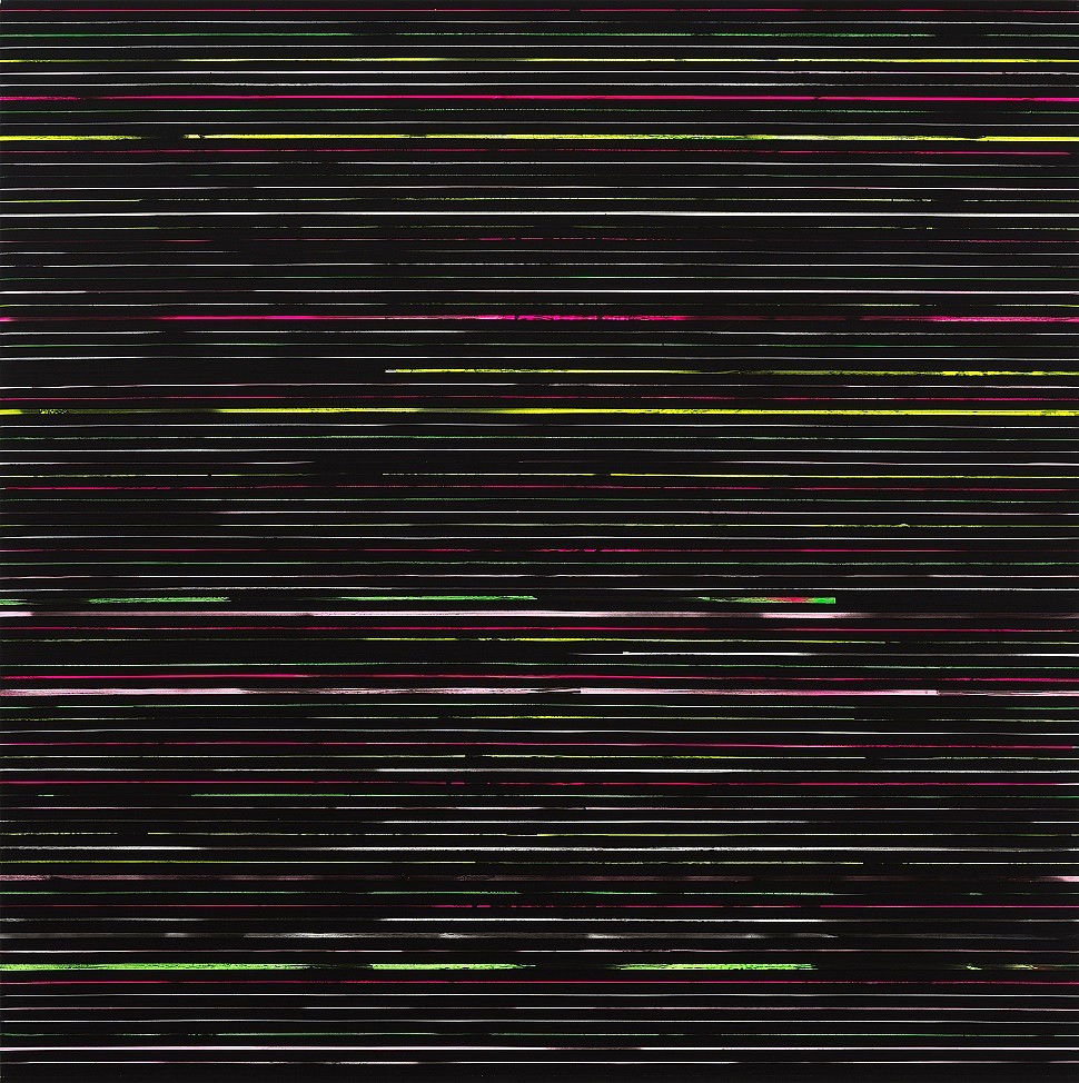
There are a multitude of contemporary rhythms in the world around us. My ambitions (as an artist) are to investigate with authenticity and transformatively re-appropriate ‘the memory of an image’. In my working practice images are formed as a pixilation of units. Usually marked out by a scanner or a plotter, the result here is a succession of coloured’ stripes’ that become a succinct and redefined translation of what came before. Working with ‘painting’, the paint is almost always applied to tape paper, and then onto media such as a table surface or cotton canvas. This creative process, in which I rearrange these ‘pixelated lines’ is done carefully with a particular reflection on a spacial formation of the memory of an image. The aim is to try to recreate the sensations and emotions that originally spurred its creation.
COLORSCAPE is a new body of works which, at its core, is my analysis and search into the distilled notions of shape and colour.
My greatest love in art is Expressionism, whenever I go to London's Tate Modern I'm always disoriented by the two magnificent rooms dedicated exclusively to Mark Rothko and Gerhard Richter. With Rothko we have witnessed the reconsideration of European art traditions and philosophies, he has created a new life of gesture-free Expressionism. Rothko (in my opinion) succeeds in this to the pure exaltation of shape and colour. Pulling inspiration from this, shape and colour became to core components of my solo project suggested by Everard Read Johannesburg Director Mark Read for early 2018.
Intense colour is now a very recognizable focus of my ongoing narrative (I think after my recent “Hyperspace Colours” project officially presented at Artissima17, Turin, curated by Flavio Arensi and produced exclusively for Editalia.) For me here the idea of 'shape' is not just the actual layout of the canvas itself - but instead an imaginative size, my shape carries on beyond the frame as a vibration and extension of it. I had the pleasure of attending a residency in late 2017 in Constantia to complete this project, and there I started with a carbon black Monochrome (Monocromo nero carbone, come di notte) first. I observed this artwork like the South African nights, charming and mysterious, and each morning I woke up with the smell of Jasmine, a simple sensual charm and unmatchable theatre that I savoured especially for this project. I then continued next with the red (Monocromo rosso brillante), pink (Monocromo rosa chiaro, in attesa del giorno), then blue (Monocromo blu profondo, a beaufiful day!), turquoise (Monocromo turschese, a wonderful day!) and finally green (Con leggera schiarita). The actual colours in my title reflect this order.